Beyond the <div>: Essential HTML Tags You Didn't Know You Needed
When I started learning web development, I barely spent more than a few hours learning HTML before moving on. I believe that most people learn "just enough" HTML before moving on to CSS and JavaScript.
HTML has come a long way compared to when it was introduced. The language's (turing complete?) native features allow us access to functionalities and levels of interactivity that were previously only accessible via third-party solutions (heavy lifting by JavaScript). Nowadays, native HTML can be used to create powerful and accessible features without the need for external libraries. Here are a few of my favorite underrated HTML elements.
Dialog
The <dialog> element allows you to create modal dialog boxes, which are often used to display important information or prompts to the user. Dialog boxes are natively supported in all major browsers, so you don't need to use any external libraries to implement them.
<button onclick="window['example-dialog'].showModal()">Show Modal</button>
<!-- It is not recommended to directly access the window object like in
     this example. This is just for demonstration purposes -->

<dialog id="example-dialog">Native Dialog is Awesome!!!</dialog>

When using dialog modals, all the behaviors of a modal such as focus trapping and background interaction blocking are built-in. Accessibility considerations include adding ARIA roles and aria-modal attributes.
<button onclick="window['example-dialog'].show()">Show Dialog</button>
<button onclick="window['example-dialog'].showModal()">Show Modal</button>
<dialog id="example-dialog">
  Native Dialog is Awesome!!!
  <button onclick="window['example-dialog'].close()">Close Modal</button>
</dialog>

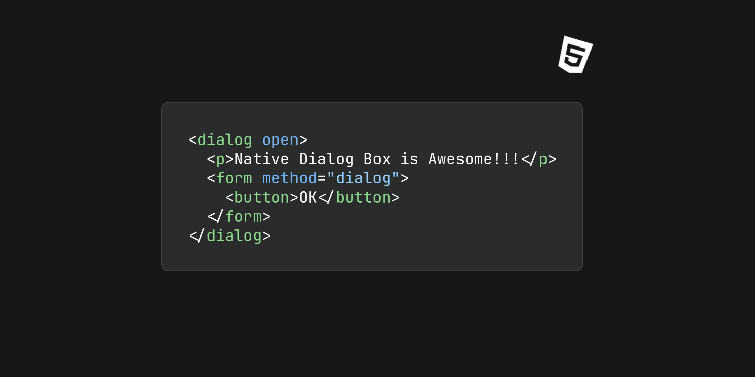
There are two types of dialogs. Using the open attribute on the dialog element or using the .show() method on the dialog element opens a non-modal dialog and using the .showModal() method opens a modal dialog. The difference is that when a modal dialog is open, everything outside of the modal is inert and interactions outside the dialog are blocked. Notice that when the dialog is open, the text behind the modal is not selectable, however, the document is still scrollable. To fix that, we could use the following CSS selector:
html:has(dialog[open]) {
    overflow: hidden;
}
:has() isn't supported by every browser (looking at you, Firefox). Check browser compatibility.<button onclick="window['example-dialog'].show()">Show Dialog</button>
<button onclick="window['example-dialog'].showModal()">Show Modal</button>
<dialog id="example-dialog">
Native Dialog is Awesome!!!
<!-- first method -->
<form method="dialog">
<button>Ok</button>
</form>
<!-- second method -->
<form>
<button formmethod="dialog">Ok</button>
</form>
<!-- third method -->
<button onclick="window['example-dialog'].close()">Close Modal</button>
</dialog>
You can close a dialog modal, either by pressing the ESC key or by using any of the methods above. To learn more about dialog, view the MDN docs or this article by web.dev.
Details and Summary
The <details> and <summary> elements allow you to create accordion menus, where users can click on a heading to expand or collapse a section of content. This is a great way to organize large amounts of information in a concise and easy-to-scan format.
<h2>Details and Summary</h2>
<details>
  <summary>Click to learn more!</summary>
  <p>Hi, this content can only be seen when details is toggled open</p>
</details>

Clicking the summary toggles the open attribute on the details element. You can also use the open attribute to include custom CSS styles based on the open state of the details disclosure widget.
details[open] summary {
  background-color: red;
}

To learn more about the <details> element, view the MDN docs.
Meter and Progress
The <meter> and <progress> elements allow you to create visual representations of progress bars. The <meter> element is typically used to represent a value within a specific range, while the <progress> element is used to represent the progress of a task.
Using <meter>, we can indicate different ranges based on what value we set for its attributes.
The attributes min, max, low and high set the ranges of the meter element, the value attribute sets the amount of the meter filled and the optimum attribute tells the browser how to color the ranges.
<h2>Meter</h2>
<meter
  id="meterLow"
  min="0"
  max="100"
  low="33"
  high="66"
  optimum="80"
  value="30"
>
  at 30/100
</meter>
<meter
  id="meterMid"
  min="0"
  max="100"
  low="33"
  high="66"
  optimum="80"
  value="50"
>
  at 50/100
</meter>
<meter
  id="meterHigh"
  min="0"
  max="100"
  low="33"
  high="66"
  optimum="80"
  value="70"
>
  at 70/100
</meter>

We can reverse the colors of the meter by setting optimum lower than low. This is useful when lower values are the preferred range.
<h2>Meter Reverse</h2>
<meter
  id="meterLow"
  min="0"
  max="100"
  low="33"
  high="66"
  optimum="20"
  value="30"
>
  at 30/100
</meter>
<meter
  id="meterMid"
  min="0"
  max="100"
  low="33"
  high="66"
  optimum="20"
  value="50"
>
  at 50/100
</meter>
<meter
  id="meterHigh"
  min="0"
  max="100"
  low="33"
  high="66"
  optimum="20"
  value="70"
>
  at 70/100
</meter>

The <progress> element is simpler than <meter> as it only accepts two attributes (aside from the Global Attributes) max and value. This element displays the amount that is filled in a single color, though not adding the value attribute animates the progress bar, which makes it look like a loading indicator.
<h2>Progress</h2>
<label for="progressVal">With attributes</label>
<br />
<progress id="progressVal" value="60" max="100">
  This isn't displayed
  <p>neither is this</p>
</progress>
<br />
<label for="progress">Without value attribute</label>
<br />
<progress id="progress" max="100"></progress>

Those keen enough may have noticed that the content between the <meter> and <progress> elements aren't being displayed. This is because it is intended to act as a fallback for old browsers that don't support these elements. They should not be confused as an alternative for an accessibility label.
To learn more about <meter> and <progress>, view the MDN docs for meter and progress, respectively.
Optgroup
The <optgroup> element, as its name says, is an element that allows you to group related options in a <select> element. This can make it easier for users to find the option they are looking for, especially if the <select> element contains a large number of options.
<h2>Optgroup</h2>
<select name="beverages" id="beverages">
  <optgroup label="Hot Drinks">
    <option value="coffee">Coffee</option>
    <option value="tea">Tea</option>
  </optgroup>
  <optgroup label="Cold Drinks">
    <option value="soda">Soda</option>
    <option value="iced-tea">Iced Tea</option>
  </optgroup>
  <optgroup label="Juices">
    <option value="orange-juice">Orange Juice</option>
    <option value="apple-juice">Apple Juice</option>
  </optgroup>
</select>

Input types
The <input> element has a wide variety of input types, including type="color", which allows users to select a color from a color picker.
<label for="color">Input: type=color</label>
<input id="color" type="color" />

Input type="file" allows single or multiple file uploads. We can also use the accepts attribute to specify the allowed file types. For example, to allow users to upload only image files, you would use the following attribute:
<input type="file" accepts="image/*" />
For specific file types, we include the string of the file extensions in a comma-separated value.
<input type="file" accept=".jpg, .jpeg, .png" />
The string
audio/*means "any audio file".The string
video/*means "any video file".The string
image/*means "any image file".
e.g. to allow any image file and/or PDF files:
<input type="file" accept="image/*,.pdf" />
To learn more about various input types, visit the MDN docs.
Anchor: Linking to HTML elements
The <a> element can be used to link to HTML elements. To link to an element, simply use the fragment identifier (#) followed by the ID of the element. For example, the following code would link to the element with the ID line-break
<a href="#line-break">Line Break</a>
Clicking the link above navigates directly to the specified element with the ID "line-break."
Bonus: VS Code and Emmet
VS Code is a lightweight IDE that is popular among web developers. It comes with a pre-installed extension called Emmet, which can help you speed up your development by providing access to snippets. To use Emmet, simply type a CSS-like expression and press Tab to generate the corresponding HTML code.

Here is a link to a cheat sheet for using Emmet: https://docs.emmet.io/cheat-sheet/
Conclusion
By learning about and using underrated these elements, you'll find yourself well-equipped to create compelling and accessible web experiences without unnecessary dependencies.
If you think that I missed an underrated HTML element, please leave a comment and share how you've used it in your project.